


ALL Social Media Ads are designed with the intention of:
A: Sharing Product information and demonstrating our superior excellence in building the highest quality hospitality tables. (brand positioning)
B: Sharing fully realized installation photos for inspiration and table design ideas displayed in their new homes as well as establishing that we build for recognizable brands and quality clients (building trust).
C: Building a Social Media following and networking with current and potential new designers, architects, and clients in an effort to facilitate brand exposure and…
ULTIMATELY DRIVING TRAFFIC BACK TO THE WEBSITE (where we process SALES).
Logo Use
Logo Guidelines: Clear guidelines ensure consistent logo usage, including placement, size, color variations, and clear space requirements.
We have a few variations of our logo available to use. One is a horizontal version with the disc on the left, followed by the company name on the right. The other version the disc is seated OVER the top of the company name. (less used)
Brand Integrity: We want to remember that in the case of visuals used on the internet, people will ‘download and save’ images, and we want our images to ALWAYS be identified as OUR work. This fact should never be overlooked without exception.
Logo Colors: The basic logo color is black with a white TD design on the black disc. Occasionally, for the purpose of insuring the logo displays well on different color backgrounds, we can invert the color (to white with black) – THIS IS THE ONLY VARIATION that should be used on the logo to not dilute the BRAND. The high contrast of black and white insures the Logo stands out in all visual scenarios.
Visual Anchor: The logo serves as the visual anchor of a brand, and consistent usage reinforces brand recognition and helps customers instantly connect the logo with the company and its values. Observe that it is used on our website, in the print media, our portfolio, and on all promotional images posted to social media platforms. Essentially, we brand any product or installation image anywhere online where it can be saved privately, so it cannot be reused without proper credit to us OR so the user can remember where they found the image, where the product was located.
Infrequent exceptions to this rule might be for key visuals used on the website.
Consistency Across Platforms: By outlining where and how the logo should appear (e.g., bottom-left corner, minimum size), businesses ensure a cohesive and professional appearance across all platforms. It is best to use it in a traditional placement (such as bottom-left corner) for eye-tracking visibility (and is occasionally only altered when it makes more sense visually, to place it in the upper left corner, such as when it is interfering in or over the image or negative space.)
Positioning: ► Eye-tracking studies demonstrate that our eyes are trained to ‘read” pages as well as images from the top left corner, to the right, then to the bottom left and off to the right – Essentially a “Z” format, so we make every effort to strategically place the brand logo in the eye-tracking path… in a place (where, for example, on Social Media)… we wish to remain consistent, since the images as a whole, are also seen cohesively.
Clear Space Requirements: We need to utilize enough space surrounding the logo to prevent crowding by other elements, and ensure the logo remains legible and impactful. One way to ensure this, is to measure the height of the logo in its entirety, and use at least HALF that height as an equal amount of space AROUND the logo, most especially where the logo meets the edge of the graphic.
PLACEMENT SUGGESTION:
Using App Specific Templates: (Like Photoshop for example,) Create a template (psd) using layers to include the stationary Logo placement. Keep the logo in place along with the inverted versions, so that it remains stationary without moving around from one ad to the next. See below.


► Alternatively, it sometimes makes better aesthetic sense to place some type of ‘block’ or semi-transparent ‘block’ behind the logo to ensure that it can be readily seen. This comes down to a matter of having an eye for a clean design and perspective, maintaining the overall idea that we are designing to maintain a brand’s persona, its look and feel.
In the examples below, the logo stands out better with a semi-transparent block behind it due to the fact that there is a strong texture in the area designated for the logo, that makes it less legible. The block used here is subtle but effective.


Typography in Design
Your audience’s ability to read your design is critical to its success. If your audience can’t make sense of the design, they won’t be able to understand your message. When deciding how to use fonts for the design, you must keep your target audience in mind. Access to our content and the ease of consuming our message in a pleasing way is an integral part of the user experience (UX).
Rules for Text Styling / Color
We have chosen a sans-serif font in a larger size for ease of reading. This can improve the audience’s experience consuming our content and provide a positive experience for them. In addition to being conscious of the cleanliness of the typeface we use, we also need to be cognizant of the surrounding space. This applies to web page designs, ads for any kind of promotion and in any graphic format. Digital, print and video.
A good rule of thumb is to limit yourself to three brand fonts: a primary font, a secondary font, and an accent font. Your primary font will be the workhorse, used for most of your body text. The secondary font should complement the primary one and can be used for headings and subheadings. This font is typically a sans serif style font. It can be styled for example, Capitalized or Uppercase and in Bold as a way to increase the Heading Factor without straying from the cohesiveness of the overall type.
On our website we use the font Catamaran. On our images we use Calibri. Calibri is a fairly new font and pairs well with our logo. It’s clear, clean, easily read, slightly rounded and plays nicely in different weights for headings and highlights. We move forward with the standard rules of font use in design below…
ADD INFO ON USE OF STRATEGIC COLOR:
Ad colors should be subtle enough to draw attention to the product and / or installation being featured. With that mentioned, color used on fonts should be used strategically when and if you want to focus on a word or phrase for emphasis.
Rules to Help Optimize Text for Reading and for Text Styling
- Referencing Graphic Design Rules, we want our Designs to be Legible and Easy to Read.
- Standard Fonts Are Better Than Decorative Ones.
- Maintain Alignment. Use Left Alignment and/or on Ads, align the Ad copy in clean blocks of text.
- Use No More Than Three Typefaces.
- Use Colors that insure the Words can be Read on the Background they’re on. (High contrast, clear, no blur.)
- Avoid heavy blur, shadows, or other font style effects.
- Be CLEAN and CONSISTENT
Rules for Stylizing Paragraphs, Headings and I-Capping
SENTENCE CASE: Capitalize only the first word of the heading and proper nouns, leaving the rest lowercase.
EXAMPLES:
“The importance of reading.”
“We end the year in December and begin a new year in January.”
HEADING CASE:
► ALL CAPS: Using all-caps is part of a deliberate design choice. It can be used for EMPHASIS to call attention to a single word or phrase. All-caps can be used in headlines, especially in print media and helps for the headings and CTA’s to stand out (primarily for website use.) ALL CAPS can however be problematic in some cases. It can appear to be ‘yelling’ or on occasion less legible, difficult to read. All-caps can make headings visually cluttered and less engaging.
► I-Capped Title Case:
In Heading Capitalization, “I-Capping” refers to capitalizing the first letter of each word, except for certain words like articles and conjunctions, following Title Case rules.
Capitalize the first word of a heading, and then capitalize all major words (nouns, pronouns, verbs, adjectives, adverbs) and some prepositions and conjunctions, while leaving minor words (articles, short prepositions, some conjunctions) lowercase.
- Exceptions to Title Case:
- Articles: “a,” “an,” “the” are typically lowercase.
- Short Prepositions: “in,” “on,” “at,” “to” are typically lowercase, but this can vary by style guide.
- Coordinating Conjunctions: “and,” “but,” “or,” “nor,” “for,” “so,” “yet” are typically lowercase.
- The Infinitive “to”: “to be,” “to go” are typically lowercase.
EXAMPLES:
All Caps: THE IMPORTANCE OF READING
I-Capped: The Importance of Reading
Images & Graphic Designs
Suggestion:
Using App Specific Templates: (Like Photoshop) Create a template (psd) with stationary Logo placement. Keep the logo in place along with the inverted versions, to keep it stationary without moving it around from one ad to the next. (Visual Demos below)…
We don’t have many hard and fast rules with regard to creating images for ads or social media other than maintaining a high-quality image that adheres to professionalism and is suitable for a reputable business presence. We want to maintain the same kind of persona that previous images have demonstrated for Table Designs and aren’t gimmicky or less than suitable for all audiences and portray professionalism.
The only requirement we need to adhere to is to ensure that the image resolutions that we use to create, for example on Social Media, are large enough to accommodate the required image sizes on the individual platforms. So, for example, Instagram required that we create square images of 1080 x 1080 pixels and then recently changed the catalog-facing images to Vertical 1080 x 1350 pixels or Horizontal (Landscape): 1080 x 566 pixels. Since the internal image is still a full 1080 x 1080 pixels, we are still creating for Instagram in that format.
We also need to recognize that we save them in the required formats (example .png or .jpg)
Instagram Feed Posts:
Square: 1080 x 1080 pixels, 1:1 aspect ratio.
Vertical (Portrait): 1080 x 1350 pixels, 4:5 aspect ratio.
Horizontal (Landscape): 1080 x 566 pixels, 1.91:1 aspect ratio.
Instagram Maximum file sizes are typically 8MB for JPEG/JPG and PNG.
For videos, the maximum file size is 4GB for regular feed videos and 250MB for Stories and Reels.
Facebook Feed Posts:
Facebook images are quite a bit more flexible, offering many options (you can check on Google). However, we typically use the same images that we create for Instagram on Facebook. So, 1080 x 1080 px.
Linkedin Feed Posts:
Link Preview Image: 1200 x 627 pixels
Stories: 1080 x 1920 pixels
Color Palettes
Brand Integrity: For the purpose of maintaining our brand, we don’t deviate from the primary colors used (as discussed in the Logo section). This pertains equally to most of what is done on the website and should be emulated in any hard copy media to coincide with the established brand. However, as it pertains to Ads for Social Media and to promote installations and products, we have a much wider area for creativity.
Whole courses are taught on the psychology of color in advertising but for the purpose of this guideline, we will attempt to condense and focus on the more important factors as it to pertains to our purpose in design.
Color plays a big part in the conscious and unconscious decisions we make, not just in choosing a product or service, but even in everyday life. It influences audience perception and drives desired actions. By understanding color psychology, marketers can choose colors that evoke specific emotions, enhance brand recognition, and in the end, boost campaign effectiveness.
How Color Influences Our Decision
Understanding color psychology and the universal reactions to specific colors, we can choose palettes or identifying colors to create a certain mood or evoke a certain reaction, like for example a Call-to-Action, where we want our user not to overlook something that is written in the content or to more importantly, take action; click a link or button. Colors are used strategically in advertising to evoke different moods and actions.
Individual Colors:
Each color in the spectrum can make us feel a certain way by association. This is typically unconscious. These are the most common associations we see in color psychology. There are both positive and negative emotions that we can attribute to each color to however here we will illustrate the positive connotations associated with the primary and secondary colors we use to convey a feeling and to draw attention selectively in our marketing materials.


Not featured in our color chart, Gray is an especially useful and effective color choice for things like website designs or backgrounds in ads and promotions. Gray in design is very popular since it offers a versatile and modern aesthetic and evokes a feeling of intellect, sophistication and wisdom. It plays well with almost every color harmoniously and most importantly helps our dominant color to draw attention and focus on the products we feature.
Gray is often used for backgrounds, navigation, and typography to create a clean, sophisticated, or minimalist look. It is entirely neutral. It can be paired with other colors to create unique and harmonious combinations. It is subdued enough for the products and focal points of our ads to stand out against it and not compete with it.
Skillful use of gray evokes wisdom and sophistication. Gray has a distinct effect on the surrounding colors, working both to balance tones and establish negative space in lieu of white. In use, it is a sleek and timeless color that is the perfect neutral and often goes unperceived. It works perfectly to serve other colors to stand out center stage.

Choosing the gray to use for your creative ad depends on the color or color scheme that you choose to use to draw your users focus. To choose between warm gray and cool gray, you can keep this color science in mind; Warm grays have undertones of yellow, red, or brown, while cool grays have undertones of blue, green, or purple. This affects how the gray appears in different lighting and with other colors. To establish if the gray you’ve used is cool or warm, simply open the hue in Photoshop and look at the color temperature gauge to see where it falls.
Website Key Hexidecimal Colors: The gray that we use on the website is #F3F3F3 and the green that we use for highlights, CTA’s and active links is #009102.
White Space and Spatial Considerations

Negative Space in Design:
The image to the left is Rubin’s vase, a famous optical illusion that demonstrates the concept of negative space in art and design. It demonstrates how the negative space around the vase forms the silhouettes of two faces in profile, a well-known example of figure-ground reversal, by emphasizing that negative space.
Figure/ground refers to how we perceive objects to differentiate the main object (person, place or thing) that we are looking at from its background. In this case, the figure is a vase and the black, or silhouette faces, are the ground object (background). For our design purposes, our aim is to distinguish the primary focal point from any text as well as make the image and / or ad easy to visually scan, so our viewer doesn’t miss relevant information, keeping the design easy to read.
Negative space, also known as white space, isn’t just empty space — it’s a deliberate element that helps to define the subject, enhance clarity, and even guide the viewer’s eye. Strategic use of negative space can make designs more visually appealing, readable, and memorable. Properly using negative space helps guide the user’s eye, making it easier to scan and understand the information presented.
How We Distinguish Between Figure and Background
Figure-ground perception describes one of the most fundamental ways that we simplify a visual scene. When looking at a visual scene, people tend to look for ways to differentiate between the figure and the ground.
In advertising, the foreground contains the primary focus—the subject, product, or message—while the background supports, complements, and adds context to the foreground without competing for attention. Designers use various techniques, such as contrasting colors, blurring the background, and employing leading lines, to ensure the foreground stands out, guides the viewer’s eye, and effectively communicates the ad’s message.
The foreground is the main subject or message that grabs attention, while the background provides context and supports the main elements without distracting from them. A balanced relationship between these two layers is crucial for effective visual communication.
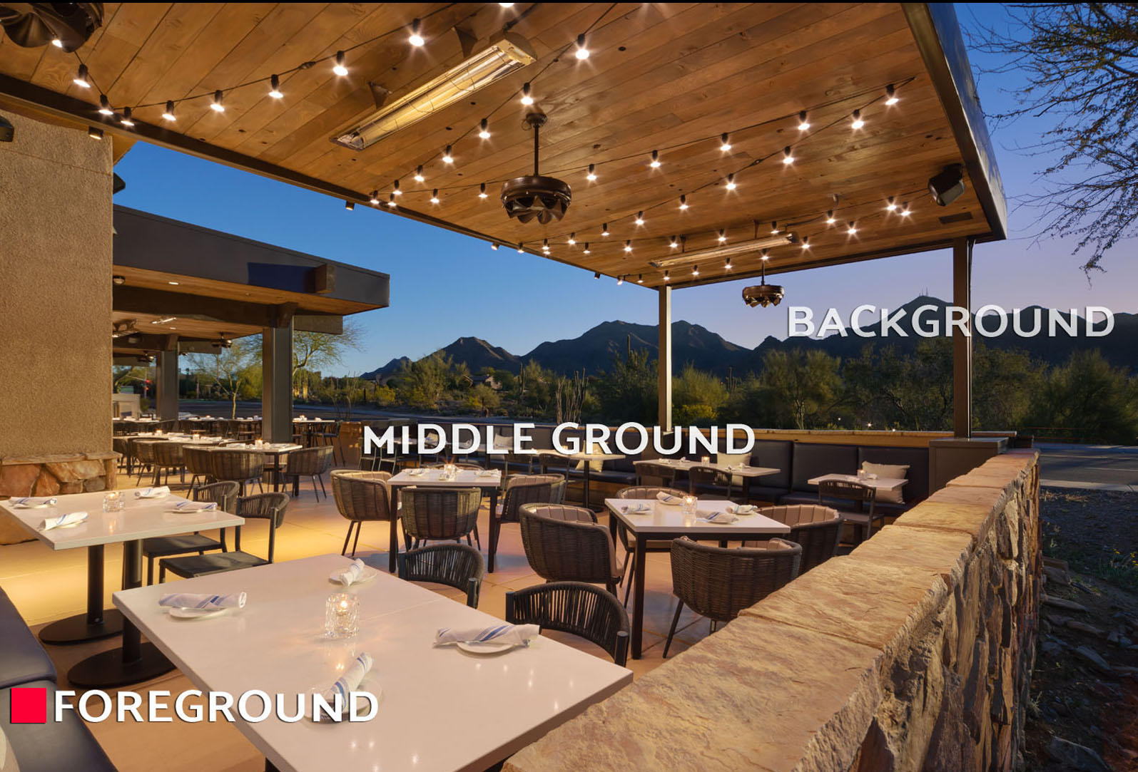
FOREGROUND IN ADVERTISING
Foreground: The Main Focus.
The foreground is (and should be) the “Star of the Show” and is designed to communicate the key message, call to action and attention to the product.
Techniques to Emphasize:
Keep the foreground elements in sharp focus while blurring or softening the background to isolate the subject.
Using high color contrast between the foreground and background can make the main element “pop” or stand out. Employing warm colors like reds and oranges, advance visually and feel closer to the viewer. If using cooler colors in the foreground, capitalize on size and refrain from warm colors in the background since they do draw focus.
BACKGROUND IN ADVERTISING
Background: Context and Support
The background is the area behind the foreground, and its role is to enhance the overall ad without competing for attention. (See our Instagram Ads for many examples)
Purpose: To provide atmosphere, context, and aesthetic appeal that complements the main subject.
Techniques to Support:
A busy or distracting background can overwhelm the foreground and confuse the viewer, so it’s important to aim for subtlety.
Simplicity: Keeping the background uncluttered or using a simple texture to avoid overwhelming the viewer and competing with the main message.
HOW THEY WORK TOGETHER
Directing the Viewer’s Eye: By strategically using techniques like leading lines in the foreground or softening the background, designers can direct viewer attention to the most important information or product focus.
Creating Depth & Dimension: The interplay between the clearly defined foreground and the supportive background creates a sense of depth and can make an advertisement feel more immersive.
Enhancing Message Clarity: A well-designed background supports the message conveyed by the foreground contents, adding context and emotion without causing confusion or overwhelming the viewer.
Balancing the foreground and background is key to creating a successful advertisement
Harmony and clutter: A busy or distracting background can overwhelm the foreground and confuse the viewer, so it’s important to aim for subtlety.
Visual storytelling: The relationship between these two elements can convey a story or an emotion. For example, placing a subject against a vast, distant landscape can evoke a sense of ambition or calm.
Contrast and color: Smart use of color contrast (e.g., vibrant foreground against a muted background) is a powerful way to ensure the most important part of the ad is noticed instantly.
Leading the eye: Techniques like “leading lines” can be used to draw the viewer’s gaze from the foreground through the middle ground and into the background, giving a two-dimensional ad a sense of depth and finally drawing the viewers eyes to the most important information or attention to the featured product.

FOREGROUND IN ADVERTISING
Techniques to Emphasize:
Keep the foreground elements in sharp focus while blurring or softening the background to isolate the subject.
Foreground: The Main Focus.
The foreground is (and should be) the “star of the show” and is designed to communicate the key message, call to action and attention to the product.
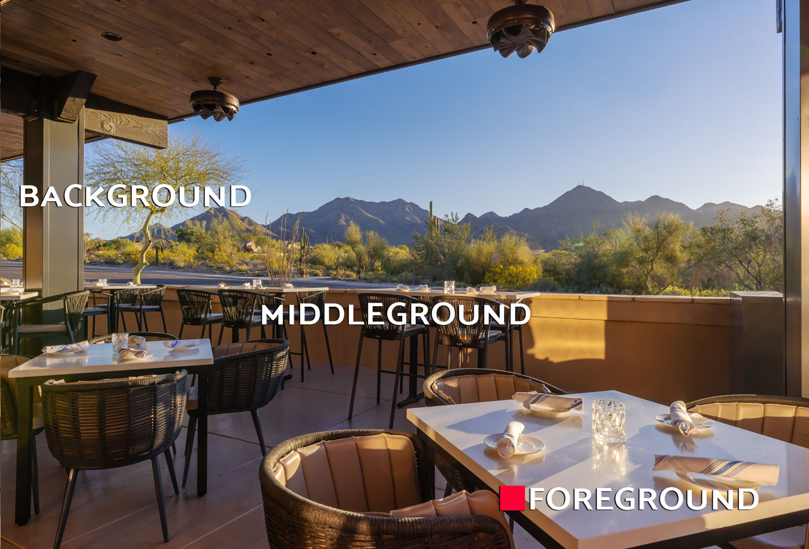
Leading lines in design are visual elements that guide the viewer’s eye through the composition toward a focal point or an area of interest. They are a compositional tool used to direct attention, create a sense of depth, establish a visual flow, and emphasize the subject of the design. Whether that subject is a product, feature or CTA *Call to Action*. This can simply be the way the photo was composed to create angles from the furnishings in the room.
In the photo to the left, the leading line follows along the “Z” and guides us along the table edges towards the product in the bottom left, leaving us with a perfect negative space to use for any message we wish to convey.
In eye tracking studies, a viewer’s eyes (in the US and those countries that learn to read from the top left to the bottom right.…) are accustomed to subconsciously begin ‘reading’ an image from the top left and flowing through the image first to the right, then moving through to the bottom left corner and falling off the image sliding through to the bottom right… in what is essentially a “Z” pattern. Organizing an ad utilizing this formation with an accompanying area for negative space, is an optimal setting for a most effective ad.
How Leading Lines Work
It is important to remember the physical ‘lines’ that the elements form, as well as the implied lines that connect elements and guide the viewer’s eyes to the intended focal point. When choosing the right image for an ad or composing a photograph for any promotion, it is a great idea to keep the following guides in mind…
Natural Lines: Roads, rivers, or even the curves of a beach.
Man-Made Lines: Buildings, fences, or graphic elements like furnishings.
Implied Lines: Created by the direction a subject is looking, or by the arrangement of several elements.
Shadows: The direction and shape of shadows can also act as leading lines.
Color and Tone: Variations in color or thickness can create visual rhythm and guide the eye.

CONSTRUCTING AN AD
As we step through the construction of an AD …. let us acknowledge that this particular *image/banner* is not a format carved in stone, but is a case example where we were ‘fitting’ a landscape image into the required square format for Instagram and used a banner for the detailed Trade Show information.
Choosing the right image requires that we select one that fits our topic and allows us to place pertinent Calls to Action or other important information along the eye tracking path and will successfully utilize the negative space.
Moving forward, we’ll use what we know (from previous topics), i.e., the spatial considerations, the foreground/middle ground where we wish to highlight the product, and the negative space that will allow us to include any written information we wish to convey or even just to include our branding along with the product, prominently.

Step through the Construction of an Ad Below…


Marketing: Each company determines the platforms that will best serve the effectiveness of their brand’s marketing efforts. Our primary focus is on building brand awareness, driving traffic to the website and ultimately, increasing sales.
So far, we’ve determined that Instagram garners us the most attention and find most of our representatives as well as clients have active accounts on that platform. Additionally, we take part on Facebook and Linkedin. An account has been set up on Tiktok in the event that we start taking part in more video productions.
For Social Media Posts: In developing content for social Media posts, please follow the established formula of Write, Table Description, Credits and Proper Hashtags relevant to the location/subject. (as seen in the examples below) We want our followers and potential clients to know they can rely on our information consistency and credit those involved in providing us the photos we used, and when applicable, venues involved.
(See more examples on our social media platforms)
Table Descriptions should be accurate from Kevin or Amanda:
Credits are added for the @Designer, Venue, and / or Photographer that were involved and / or provided the installation photos. Include their accurate @ name used on the platform when possible. (Research this from their websites or Socials to be sure.) It is important to include credits for the feature whenever possible, in order to build our network, develop our following and to promote the fact that we work with small businesses as well as high profile clients.
Also: I-Cap Key Phrases in the post. Example: Hospitality Design
Writing Content: All copy should be clear, concise and condensed in a professional format. Polite and matter-of-fact.
A more friendly voice is applicable, of course, when writing short responses to comments or product inquiries.
SEE MORE about our Brand Voice used in “Writing & Copy”.


Image Sizes: It is important to stay current on the sizing requirements per Social Media Platform since they occasionally change. Recently, Instagram changed the outward facing image catalog sizes but they didn’t change the size of the ACTUAL post (when you click on it) … so the decision was made to maintain continuity and continue to create the actual Social Media image in the 1080 x 1080 pixel format, since the opened post utilizes more screen space.
Note: It also helps to understand WHY we include things like use Hashtags. They are most relevant in SEARCHES and help us and our products to be found. This refers to Search Engines and on Social Media Platforms.
IMPORTANT DON’Ts on SOCIAL MEDIA:
AUTHENTICITY & ETHICS:
- Don’t share content without proper permission or credit.
- Don’t buy followers; focus on organic growth with real, engaged followers.
- Don’t use excessive or irrelevant hashtags .
- Don’t post political or controversial topics: that could alienate your audience.
Video
Studies show that 55% of internet users watch videos every day, and 78% of people watch videos online every week. To add to that, 54% of the surveyed wanted to see more video content this year. That makes video content the most popular type of social media asset your brand can invest in. ((per link))
Effective social media video ads grab attention instantly, tell a simple story, prioritize high-quality visuals/audio, work without sound (using captions/text), and have a clear Call-to-Action (CTA), keeping it concise (15-30s) to resonate with platform-specific audiences and drive action through emotional connection and strategic testing. Key principles involve the ABCs (Attention, Branding, Connection, Direction), audience relevance, and smooth user experience.
Advertising videos need a no-sound option because most people watch videos on social media with sound off (around 85%), often while multitasking in public or quiet spaces, and loud, unexpected sounds cause negative reactions. Designing for mute viewing using clear visuals, text overlays, and captions ensures your message is still conveyed effectively, increasing engagement, accessibility (for hearing-impaired or multilingual audiences), and preventing users from skipping or muting the ad, ultimately boosting ROI.
- Hook Immediately (Attention): The first 3-5 seconds are crucial; use strong visuals, bold text, or intriguing questions to stop the scroll.
- Keep it Concise: Shorter videos (around 15-30 seconds) often perform better, especially for Stories/Reels, but aim for clarity and impact regardless of length.
- High-Quality Production: Crisp visuals, clear audio, good lighting, and professional editing reflect well on your brand and maintain engagement.
- Mobile-First Design: Design for vertical viewing and ensure your message is clear even with sound off, using captions or text overlays.
- Tell a Simple Story: (Connection): Present a relatable problem and offer your product as the solution, guiding the viewer naturally to the CTA.
- Clear Call-to-Action (Direction): Tell viewers exactly what to do next (e.g., “Shop Now,” “Learn More”).
- Brand Integration (Branding): Weave your brand identity throughout the video subtly but effectively.
- Test & Iterate: A/B test different video lengths, hooks, CTAs, and visual styles to find what resonates best with your audience.
- Use Social Proof: Where it’s applicable we can incorporate user-generated content or testimonials to build trust.
- Understand the Platform: Tailor content to specific platforms (e.g., TikTok vs. LinkedIn) and use platform-specific features
AVOID THESE PITFALLS:
When creating business videos for social media, don’t post low-quality, overly promotional, or long videos, as these are less likely to engage audiences and can harm your brand image. Avoid making videos without a clear purpose, failing to add captions, ignoring audience feedback, or using irrelevant trends. Also, don’t post content that is unprofessional, controversial, or repetitive, and be sure to maintain a consistent posting schedule rather than overwhelming followers.
CONTENT & PRODUCTION
Dos
As an FYI, popular apps like Capcut allow a designer / developer to create engaging videos with photos as well as videos and combinations of them. In addition to the ability to layer the company logo over the video, the apps include bells and whistles like frame transitions, to create attention grabbing videos of products and installations.
Don’ts
- Don’t use dull intros or start with your logo .
- Don’t compromise visual quality; use blurry or pixelated images/videos.
- Don’t rely on trends that don’t align with your brand; they can damage your image.
- Don’t make videos too long; audience engagement drops significantly after two minutes.
- Don’t forget to add captions and subtitles, as many users watch videos with the sound off. (when applicable)
- Don’t make the content too promotional; provide valuable, engaging content instead.
Sound
Sound is a key element in marketing videos. Sound captures attention and elicits immediate emotional responses. It has an influence on the buying atmosphere and, thanks to it, consumers have a better perception of quality.
A critical rule in applying music clips is not to use copyright content without the express permission of the appropriate licensing entity. In the case of Social Media platforms, they typically provide a library of 1 minute clips that can be used in videos, however, if it is copyright music, the video can’t be used in any boosted (paid for) ads. They WILL provide the option of changing the sound used to one that is eligible for use for sponsored ads, provided the sound wasn’t included within the video and instead was applied when the video is posted, then choosing the sounds available from the platform.
Music selected should never compete with the focus of the video. It also shouldn’t pigeon hole a genre but instead be more generic, acceptable to most any audience and without using any sounds that are loud or shocking. Think conservative and BUSINESS FOCUSED, acceptable to the widest possible target audience. Music selected, even if lively or energetic should not take center stage, its ALWAYS background and not the purpose of the post; product (or service).
CREATIVE & STRATEGIC RULES
- Brand Consistency: Maintain a consistent voice and tone (e.g., formal, playful) across all videos to build identity, like Nike’s motivational or Slack’s humorous approach.
- Context is Key: Consider where and how people watch (e.g., quiet podcasts vs. loud social feeds) and adapt your audio to avoid jarring experiences.
- Music Choice: Use music to set mood (upbeat for excitement, calm for introspection) and align with your brand (e.g., luxury car ads use elegant music).
- Lyrics vs. Instrumental: Instrumental music often works best for commercial videos as it underscores emotion without overpowering visuals; use lyrical music carefully to reinforce, not conflict with, the message.
- Sound Effects (SFX): Use onomatopoeia and caption essential SFX for accessibility, but avoid cluttering audio with unnecessary background noise.
TECHNICAL & SOUND QUALITY RULES
- Clear Audio: Ensure audio is clean, free from background noise, and recorded with appropriate equipment (like dual mics for interviews).
- Volume Levels: Aim for overall levels around -10dB to -14dB for general mix and -12dB to -15dB for dialogue for a solid foundation.
- Accessibility: Caption lyrics verbatim and describe important sounds for those who can’t hear them.
Technical Requirements:
VIDEO FORMATS and QUALITY STANDARDS:
Verify that we are using proper video formats, aspect ratios and resolutions per platform standards to ensure high-quality content.
Instagram Video Production Rules: For videos, the maximum file size is 4GB for regular feed videos and 250MB for Stories and Reels.
- Aspect Ratio: 9:16 (vertical) is ideal for Reels/Stories; 4:5 for feed posts.
- Resolution: 1080×1920 pixels (9:16) or 1080×1080 (1:1).
- Format: .MP4 or .MOV recommended.
- Codec: H.264 (video), AAC (audio).
- File Size: Up to 4GB.
- Frame Rate: 30fps or higher.


Social Media